
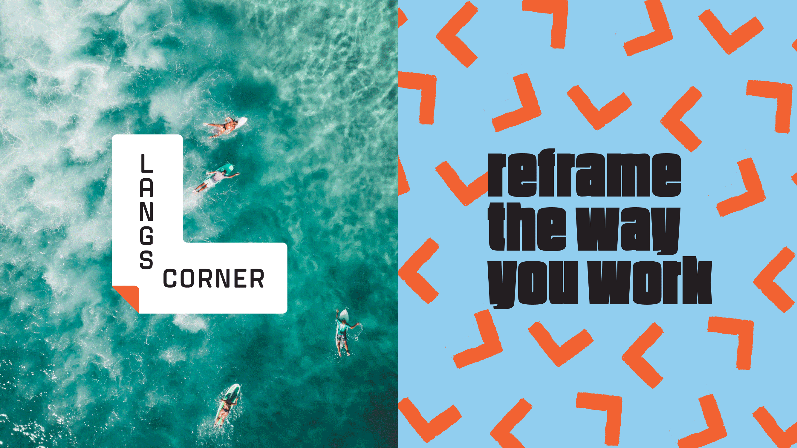
A dynamic concept that positions Lang’s Corner and the city of Wollongong as the next place to call work and home. Our contemporary logo form is simple, structural and instantly recognisable, referencing both ‘L’ for Langs and its prime corner location. This L shape element is repeated throughout the identity as a set of frames and a series of simple but bold patterns to beautifully frame the assets positioning statements. The brand language inspires re-thinking the way people live and work in the modern day and the city of Wollongong itself as a desirable CBD. The colour palette is bold, vibrant and engaging.
Address
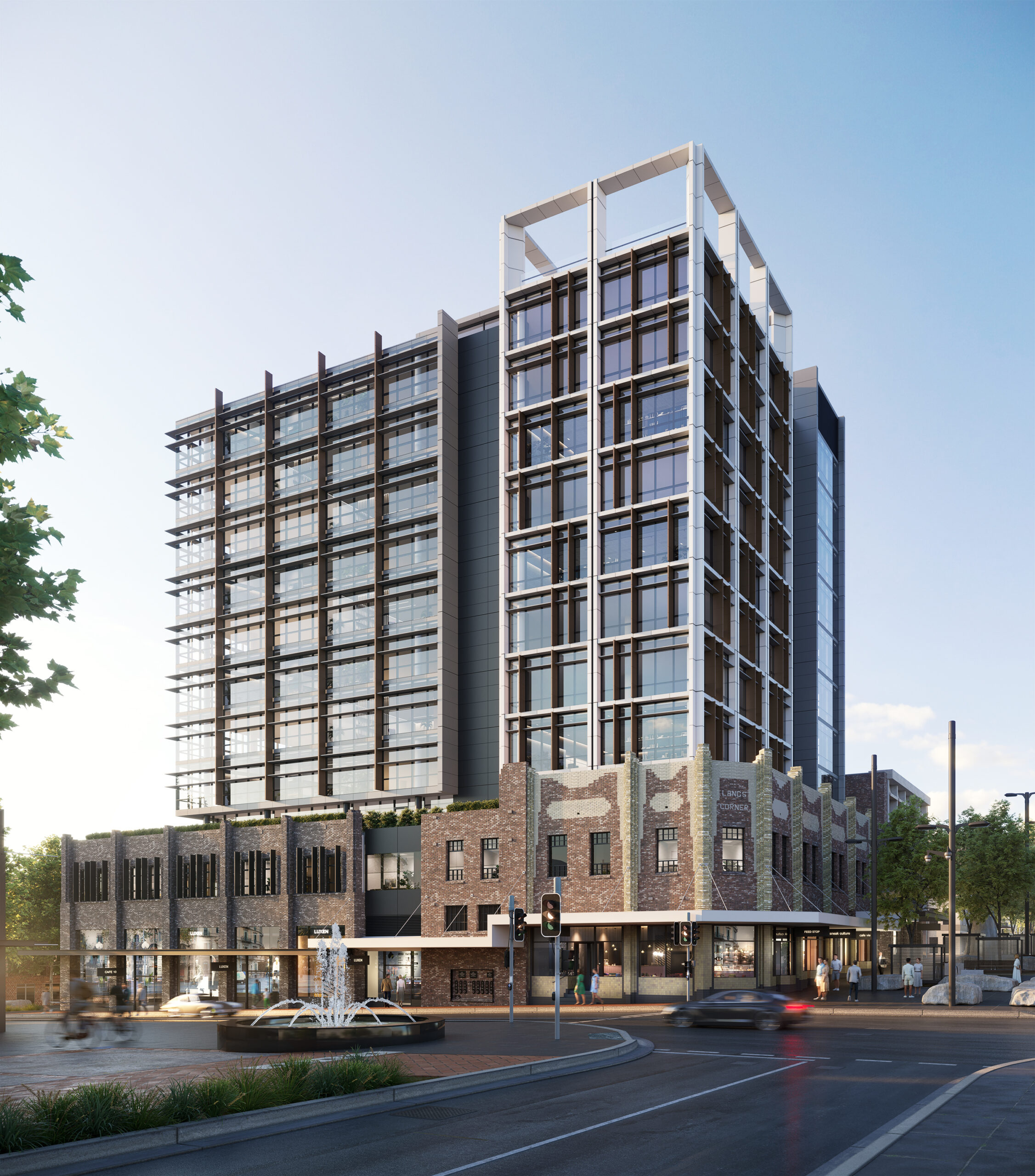
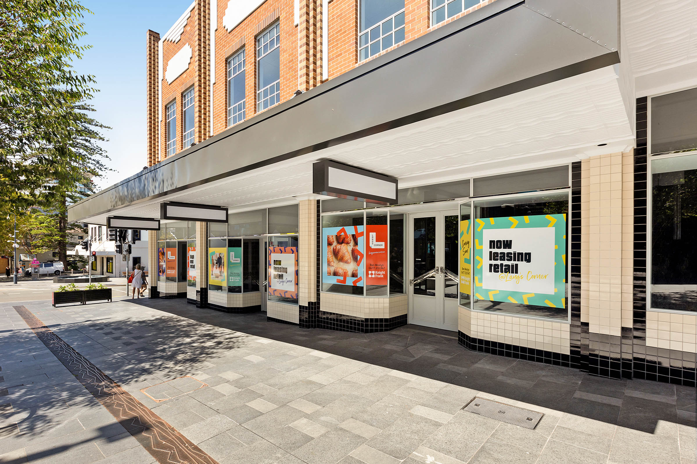
109-111 Crown Street, Wollongong NSW
Developer
Quadcorp Property
Agents
Knight Frank, Resonate Partners
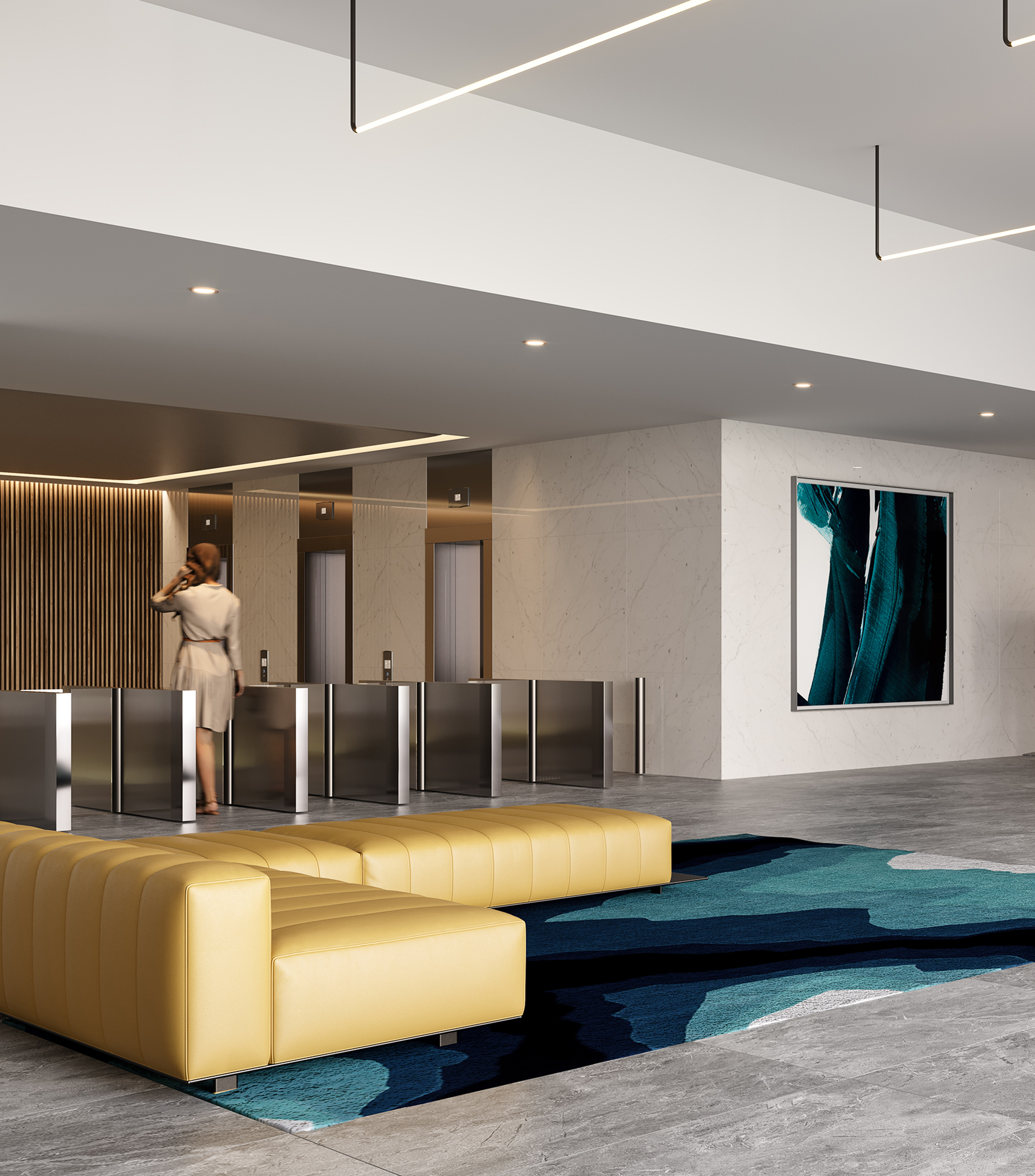
Property
A-Grade Commercial Tower Development


Want to see if we're a good fit?
Related projects

330 Collins
Layers of luxe
Cullen Royle
Property purveyors
